150 Caption Styles: What We Learned Building the Largest Style Library
We just crossed 150 styles. Here's what 18 months of building caption styles taught us about what actually works in the feed.

Kevin Li
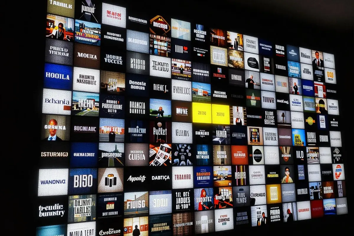
We hit 150 caption styles this week. When we launched the beta in July 2024, we had 10.
I don't want to make this a "look how far we've come" post (though it is kind of wild). Instead, I want to share what 18 months of obsessively building caption styles taught us about what works.
Most Styles Don't Get Used
This is the uncomfortable truth. Out of our 150 styles, about 20 of them account for 80% of usage. The distribution follows a power law — a few styles are wildly popular, a long tail is occasionally used, and some styles barely get picked.
You might think: "So why build 150? Just focus on the 20 that work."
Two reasons. First, the 20 popular ones aren't the same 20 for everyone. A meditation channel creator gravitates toward our Minimal collection. A fitness influencer wants Social Hype. A corporate training team picks Professional. The "popular 20" depends entirely on the creator's niche.
Second, having a large library is how users find their style. The average user previews 3-4 styles before picking one. If we only had 20 styles, some users would preview all 20 and feel like none of them fit. With 150, everyone finds something that clicks.
What Each Category Taught Us
Social Hype (30+ styles)
This is our most popular category by far. The lesson: timing is everything. A bold uppercase caption that pops in 50ms too early feels amateurish. The same caption with precise word-level timing feels professional. We spent more time on animation timing than on visual design, and that same timing obsession shows up in the auto subtitle generator.
Storytelling (20+ styles)
Popular with vloggers, travel creators, and podcast clippers. The lesson: restraint sells. Our best-performing storytelling styles are the most understated ones. Gentle fade-in, lowercase text, subtle positioning. Creators using these styles don't want the captions to be the star — they want them to be invisible-but-readable.
Music (15+ styles)
Word-by-word color highlighting synced to speech rhythm. The lesson: sync tolerance is zero. For Social Hype, being 50ms off is noticeable. For Music styles, being 20ms off is unacceptable. When a word lights up slightly before or after it's spoken, it breaks the karaoke illusion instantly. This category drove most of our timestamp precision work.
Professional (20+ styles)
Corporate training, news-style, academic presentations. The lesson: boring is good. The best professional styles are deliberately unsexy. Clean fonts, consistent positioning, no animation beyond a simple fade. The style should communicate "this is serious content" and then get out of the way.
Artistic (15+ styles)
Neon glow, glitch text, comic book, rainbow gradients. The lesson: these get shared, not used. Artistic styles have the highest "preview" rate but lower "export" rate. People love looking at them, but for actual content, they often switch to something more practical. We keep building them because they're fun and they showcase what's possible — but they're not the workhorse of anyone's content workflow.
Minimal (20+ styles)
Clean, no animation, quiet typography. The lesson: minimal is the hardest to get right. When there's no animation or color to distract, every detail matters. Font choice, size, weight, letter spacing, position, padding — get any of these wrong and the style feels "off" in a way that's hard to articulate but easy to feel.
The Font Problem
We currently ship 14 font families. Choosing them was agonizing.
Fonts have licensing. Most good fonts cost money per user or per project. We needed fonts that:
- Cover Latin + Latin Extended characters (for European languages)
- Look good at caption sizes (not all display fonts scale down well)
- Have multiple weights (we need Regular, Bold, and often Black)
- Have permissive licensing for SaaS use
That last point eliminated like 90% of our candidates. We ended up with a mix of open-source fonts and commercially licensed ones where we negotiated SaaS distribution rights.
If you're wondering why we don't support custom font uploads — this is why. Font rendering in our video pipeline requires the font to be registered at build time. We're working on a solution, but it's not trivial.
What's Next
We're adding new styles every month based on what's trending. If you see a caption style in the wild that you want us to build, let us know. We take requests seriously — several of our most popular styles started as user suggestions.
150 is a nice round number, but we're not done. The goal isn't to have the most styles — it's to make sure that every creator who uses CaptionBolt can find a style that feels like it was made for their content.
More on Caption Styles
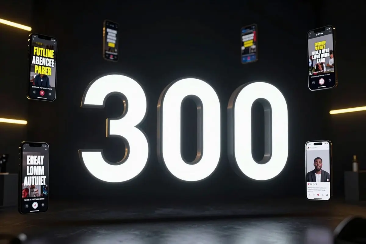
The next milestone was 300 caption styles, where we wrote more about why captions work at all. If you're choosing a style for a real video, start with how to add subtitles to a video or try the auto subtitle generator.